 Airbase
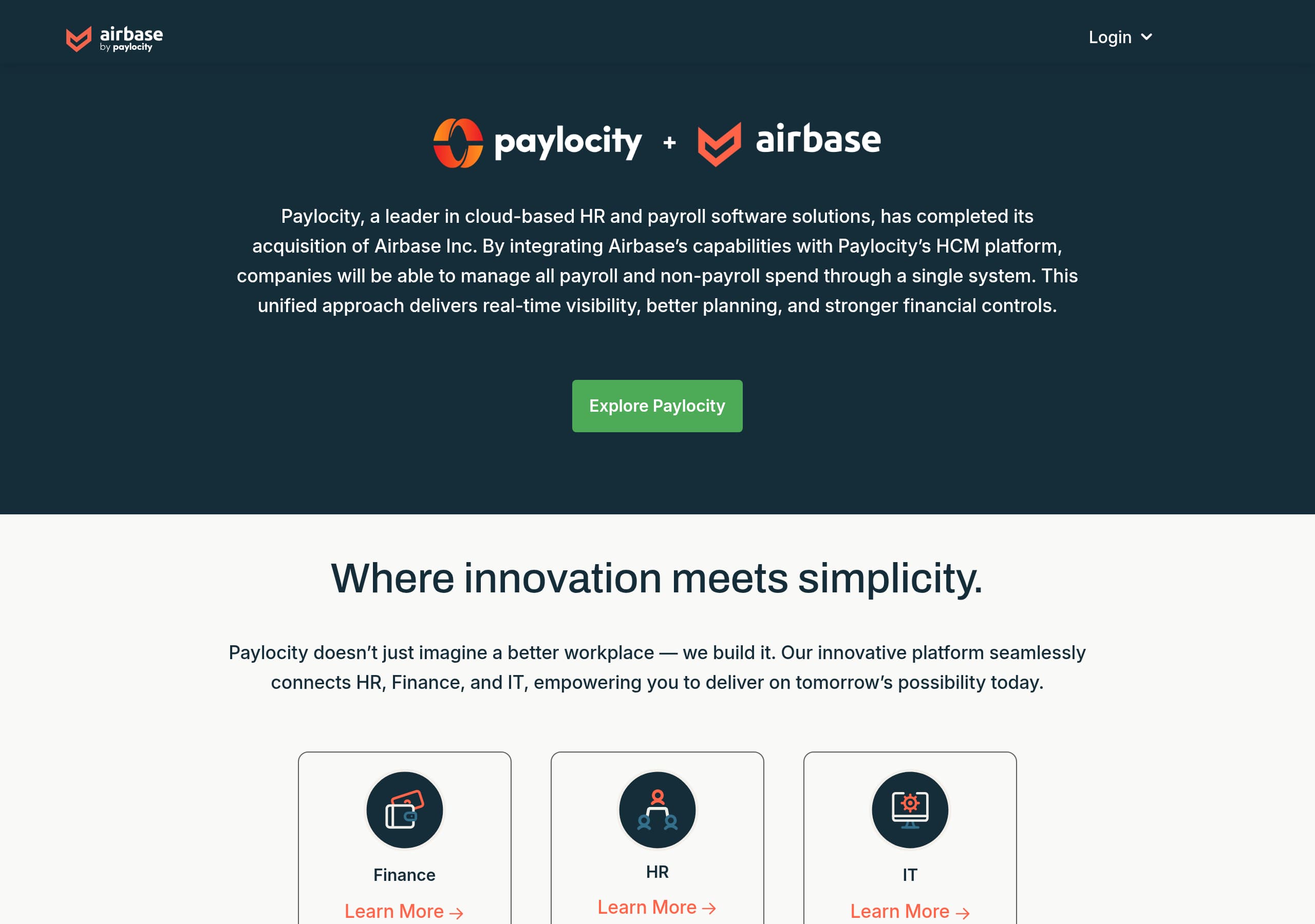
Airbase’s homepage currently leads with the Paylocity acquisition message, which is clear for existing customers but dilutes the product value proposition for new buyers unless they click through to Paylocity for Finance.
View breakdown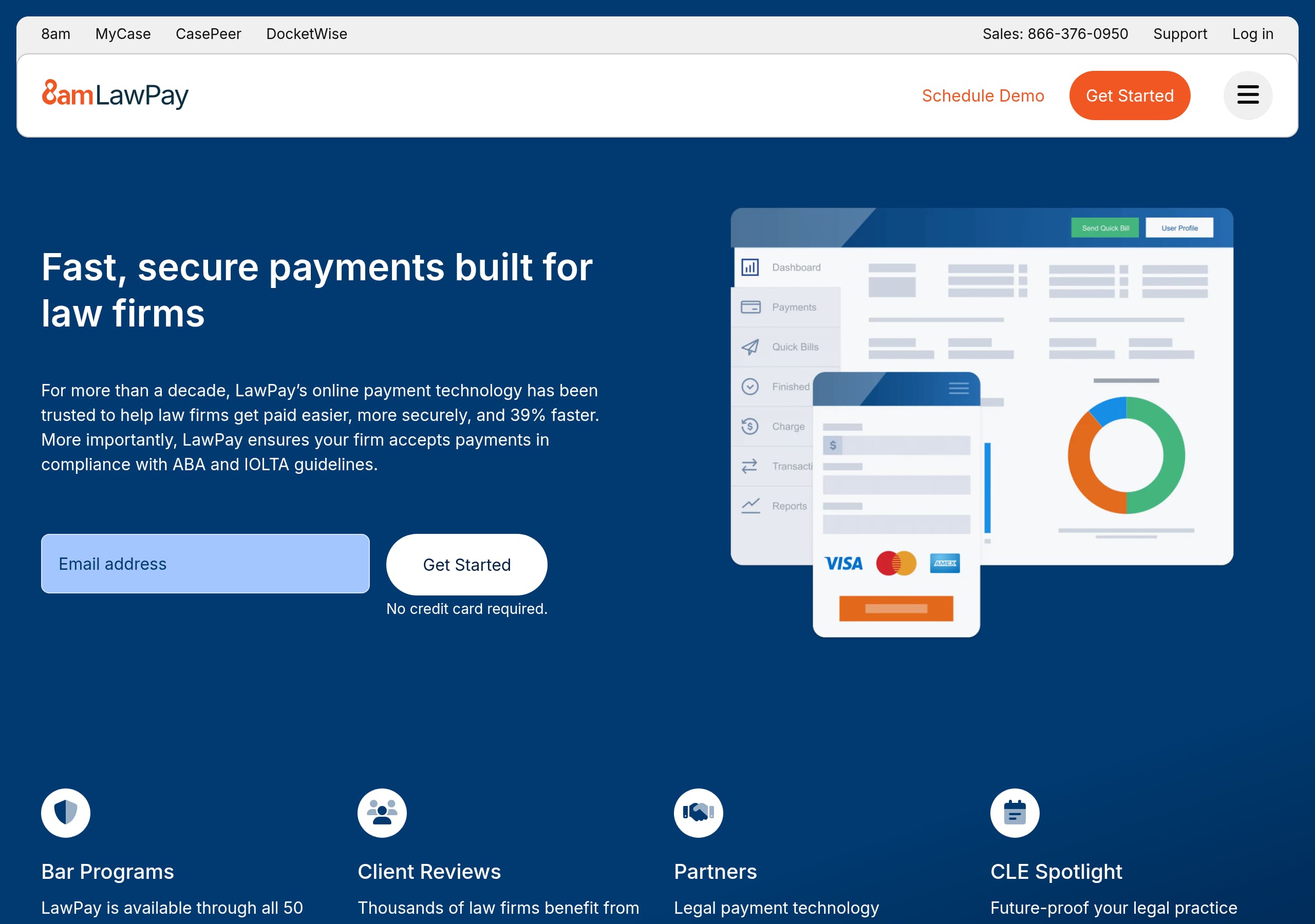 LawPay
LawPay’s homepage is conversion-ready because it pairs a single-sentence promise, “Fast, secure payments built for law firms,” with an immediate “Get Started” CTA and the friction reducer “No credit card required.”
View breakdown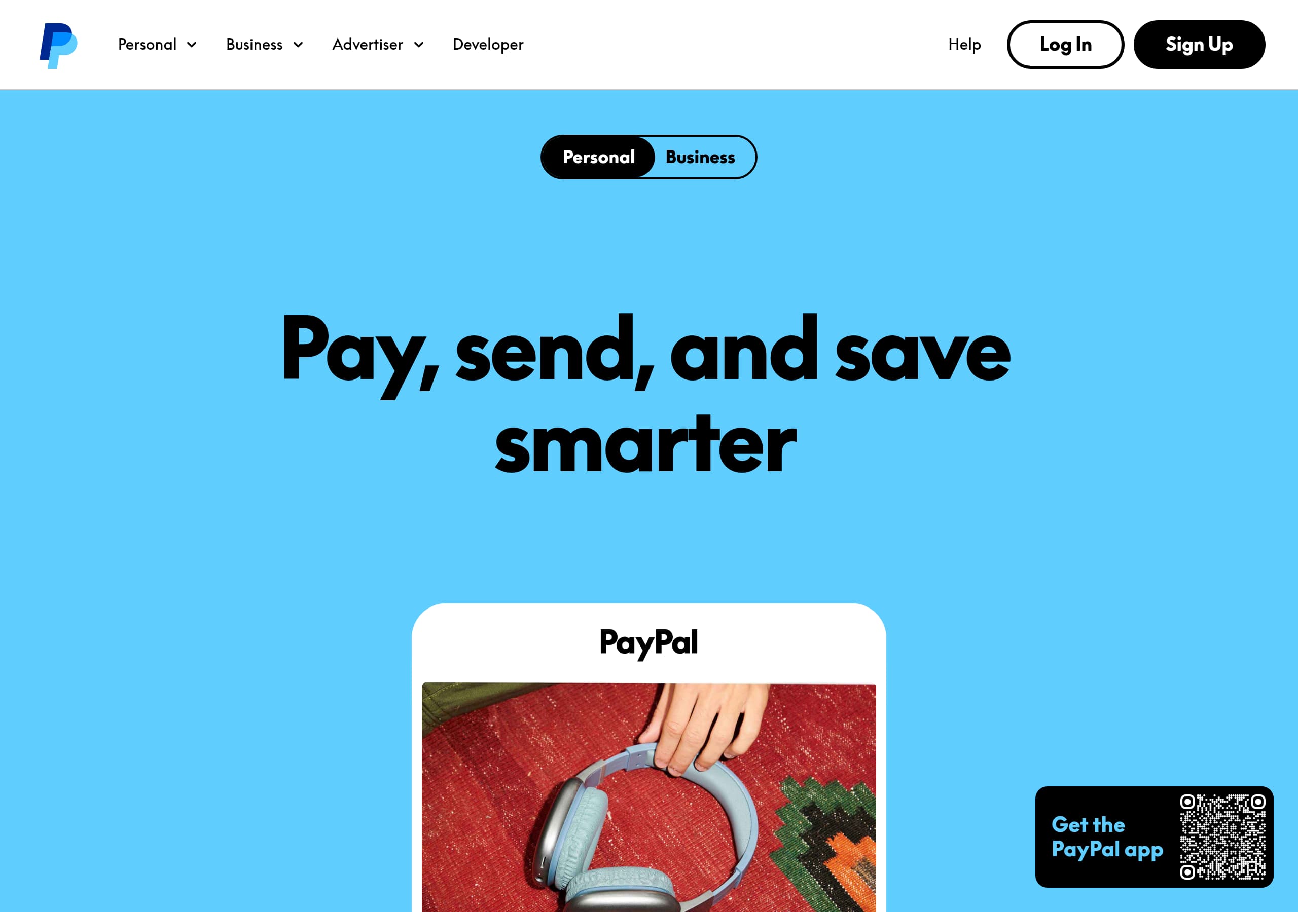 PayPal
PayPal’s homepage uses a clear two-track navigation (Personal vs Business) so visitors self-segment immediately, reducing ambiguity and improving click intent.
View breakdown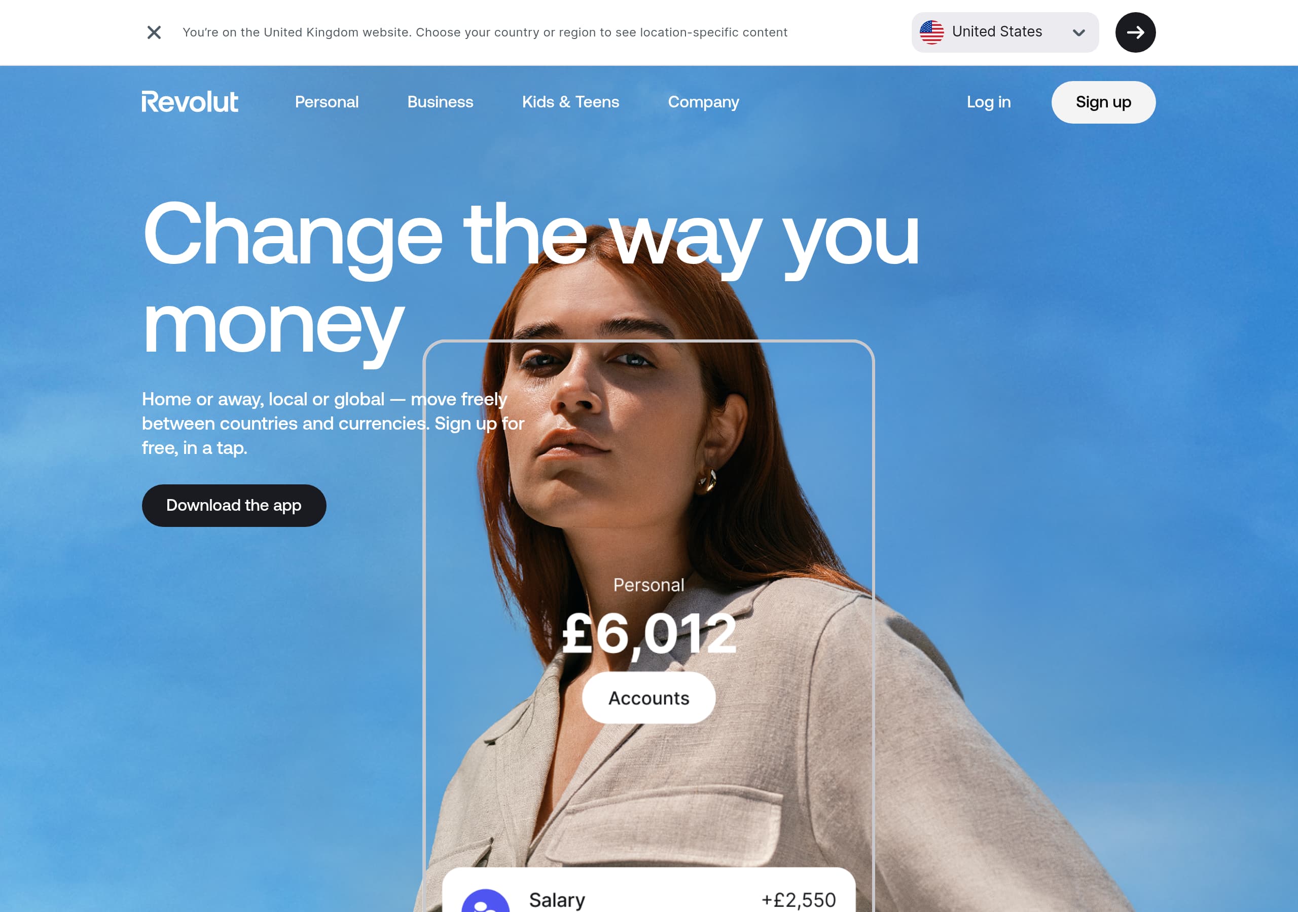 Revolut
Change the way you money
View breakdown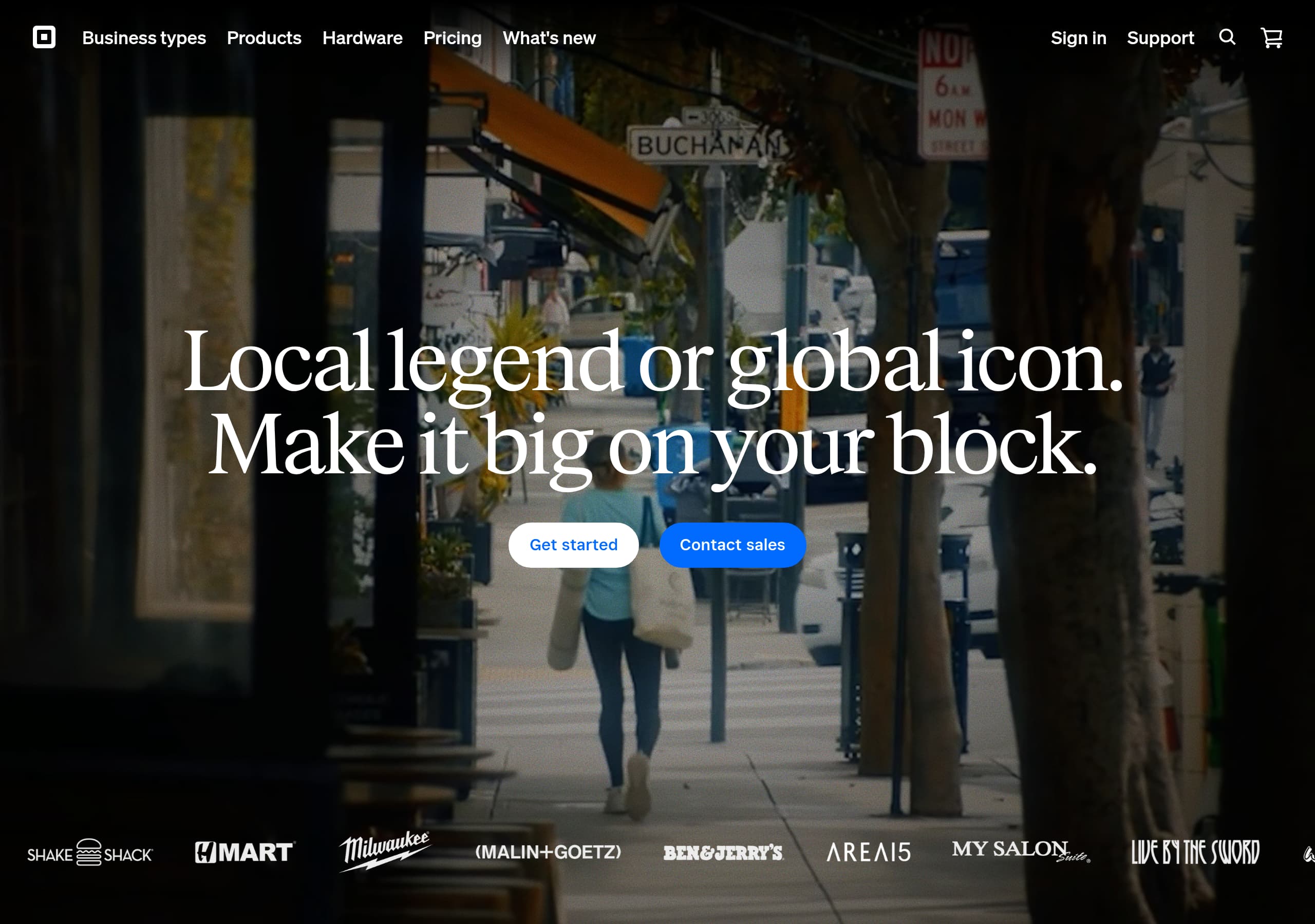 Square
Your complete business toolkit, starting at $0
View breakdown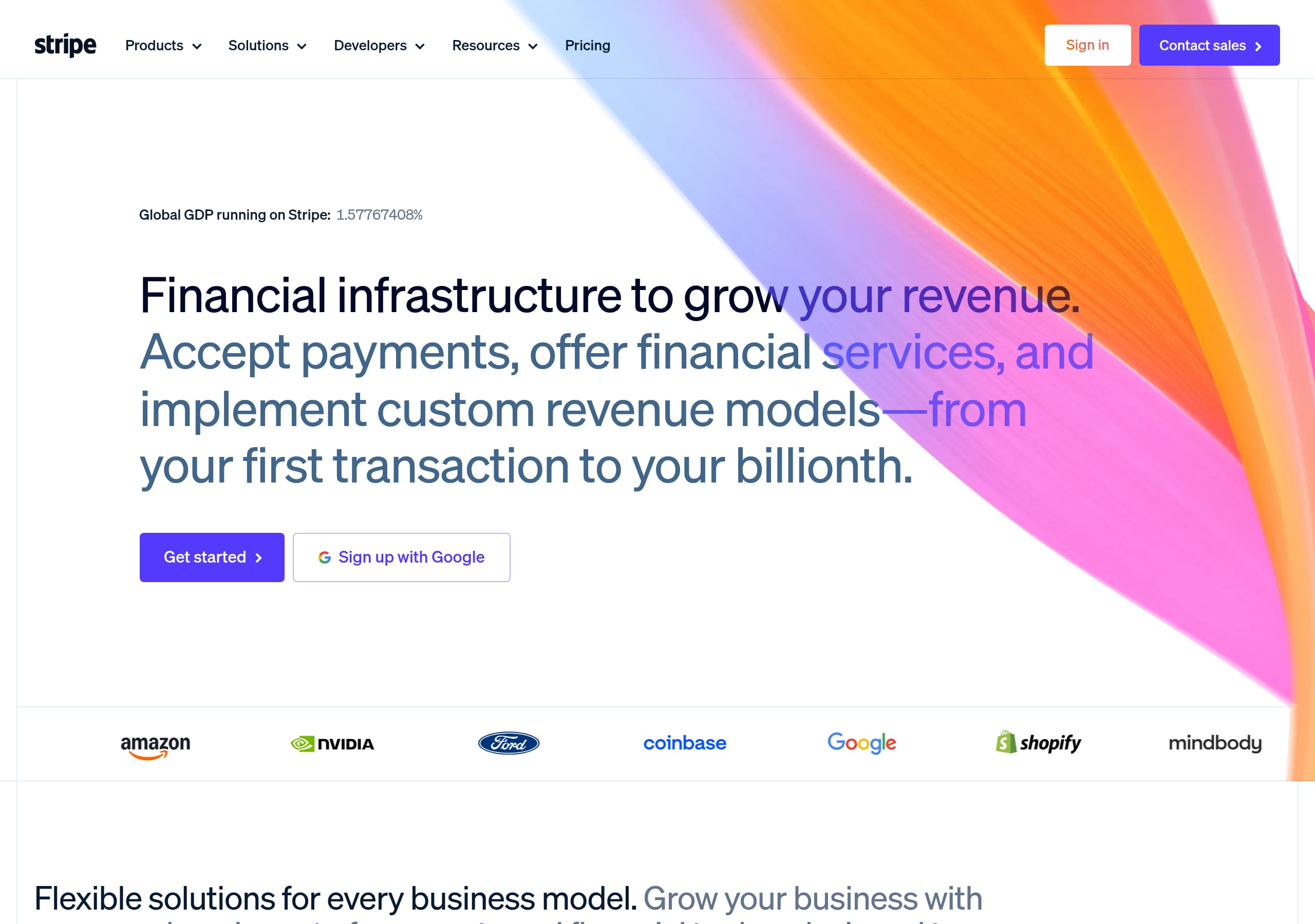 Stripe
Financial infrastructure for the internet
View breakdown
About our website breakdowns
We analyse each SaaS homepage as a full website teardown. That means we look at the hero, pricing, signup flow, trust elements, and tech stack in turn. Every breakdown comes with key takeaways, section-by-section notes, and the tools we detect. We also score each site on clarity, conversion, and trust so you can see what works and learn from the best-performing SaaS sites.