 Bloomfire
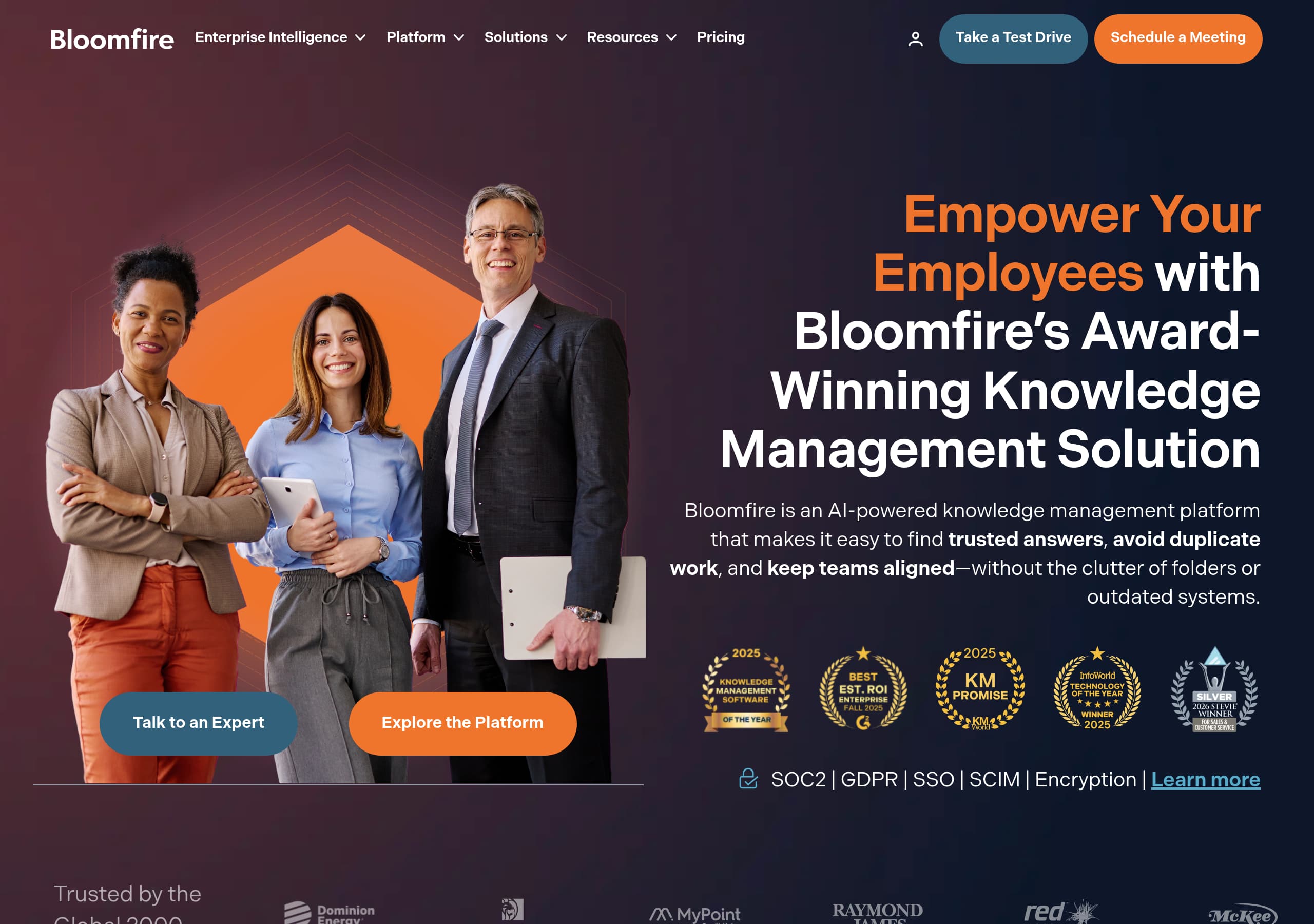
Bloomfire’s homepage is strongest when it anchors on a single, enterprise-ready promise, “Create the Intelligence Layer for Your Organization,” then reinforces it with concrete outcomes like “find trusted answers” and “avoid duplicate work.”
View breakdown Guru
GuruGuru’s homepage makes the product immediately understandable with a single-sentence value proposition, “Your AI Source of Truth,” then clarifies the workflow in three verbs: “Ask, chat, and research,” followed by “automate the upkeep.”
View breakdown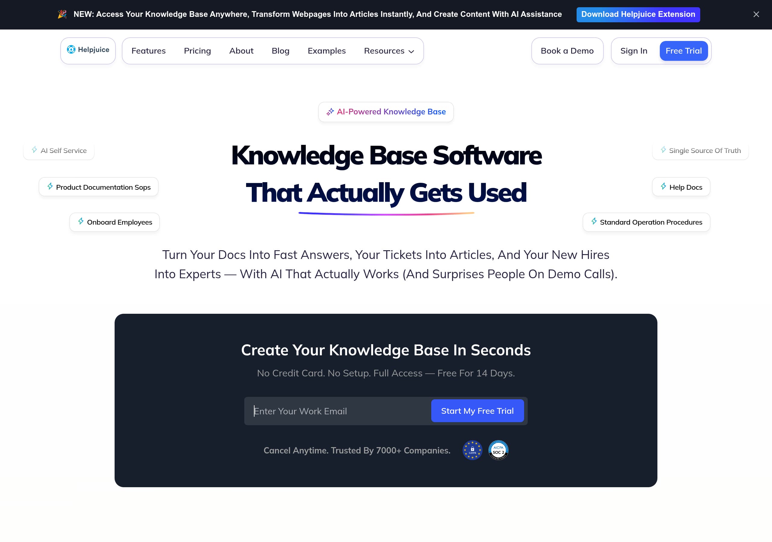 Helpjuice
Helpjuice’s homepage wins on clarity by combining a blunt positioning line, “Knowledge Base Software That Actually Gets Used,” with concrete outcomes like fewer tickets and faster onboarding, which makes the product easy to understand within one scre
View breakdown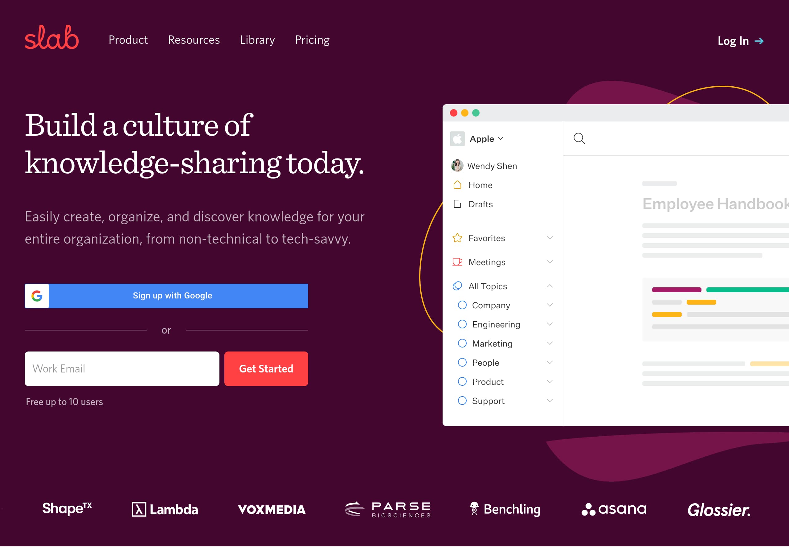 Slab
SlabSlab’s homepage communicates the outcome quickly with the headline “Build a culture of knowledge-sharing today,” then immediately clarifies scope with “knowledge base, pure and simple,” which reduces category confusion for buyers comparing Confluence
View breakdown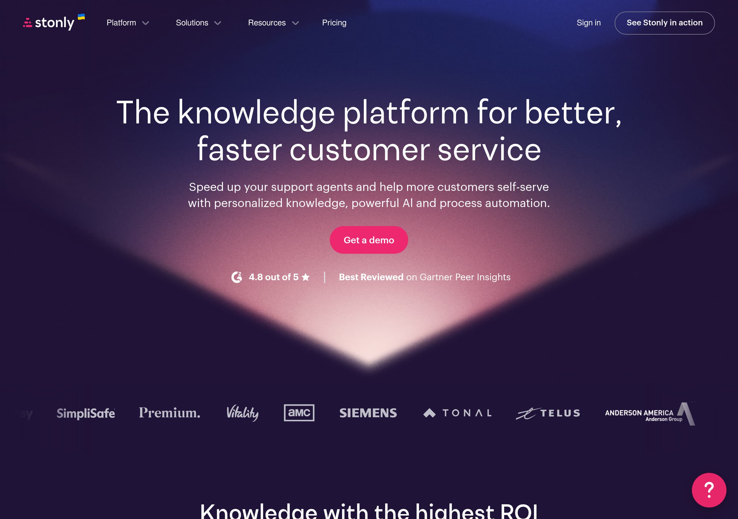 Stonly
Stonly’s homepage clarifies the product in one line, positioning it as a knowledge platform for customer service that combines **personalized knowledge**, **AI**, and **process automation**, then reinforces it with a single primary CTA, “Get a demo.”
View breakdown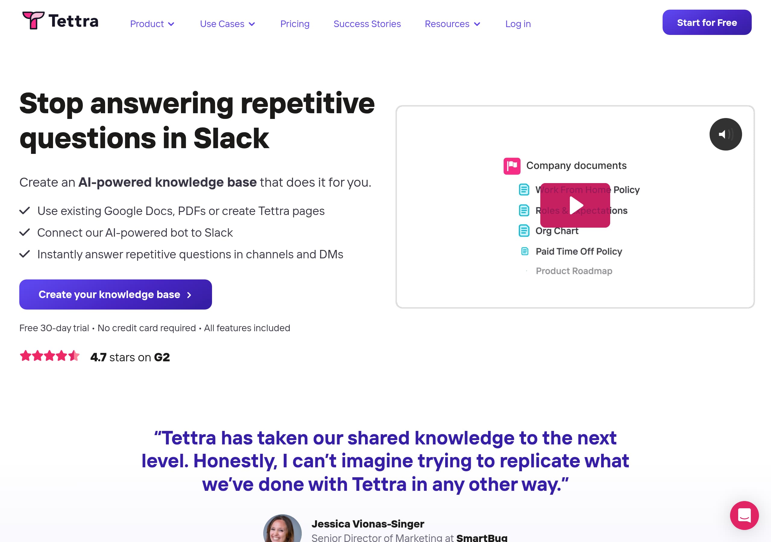 Tettra
Tettra’s homepage nails a pain-first message with an exact scenario buyers recognize, “Stop answering repetitive questions in Slack,” and follows with a simple 3-step story that explains how the product works.
View breakdown
About our website breakdowns
We analyse each SaaS homepage as a full website teardown. That means we look at the hero, pricing, signup flow, trust elements, and tech stack in turn. Every breakdown comes with key takeaways, section-by-section notes, and the tools we detect. We also score each site on clarity, conversion, and trust so you can see what works and learn from the best-performing SaaS sites.