 1Password
1Password’s homepage clarifies two distinct offers—Personal/Families and Business/Enterprise—and routes visitors with parallel CTAs like “View plans” and “Talk to sales,” so intent is captured quickly.
View breakdown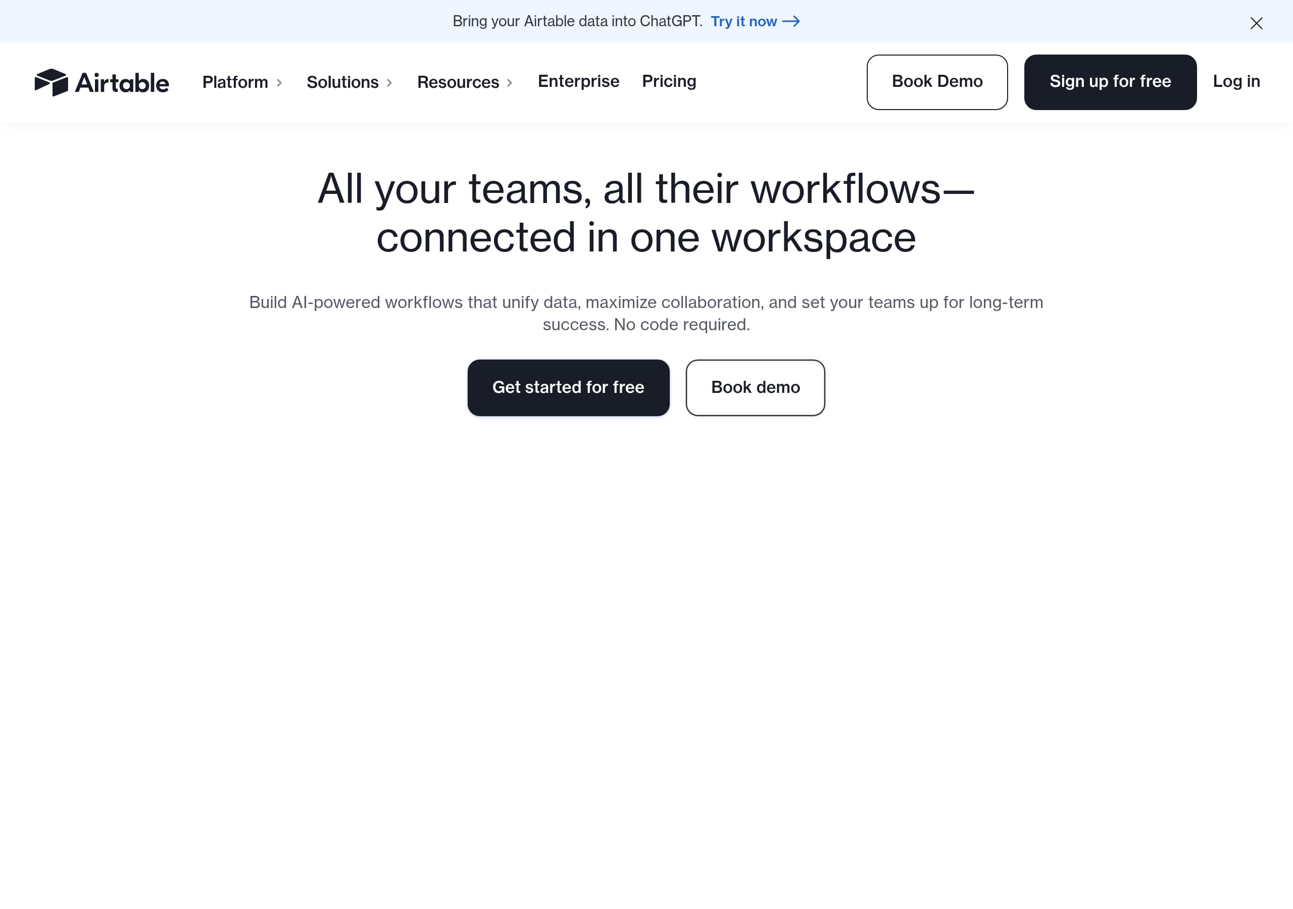 Airtable
Airtable’s homepage makes an enterprise AI positioning feel concrete by pairing a single, high-level promise (“AI workflows, apps & agents”) with four scannable pillars and immediate “Get started for free” / “Book demo” dual CTAs.
View breakdown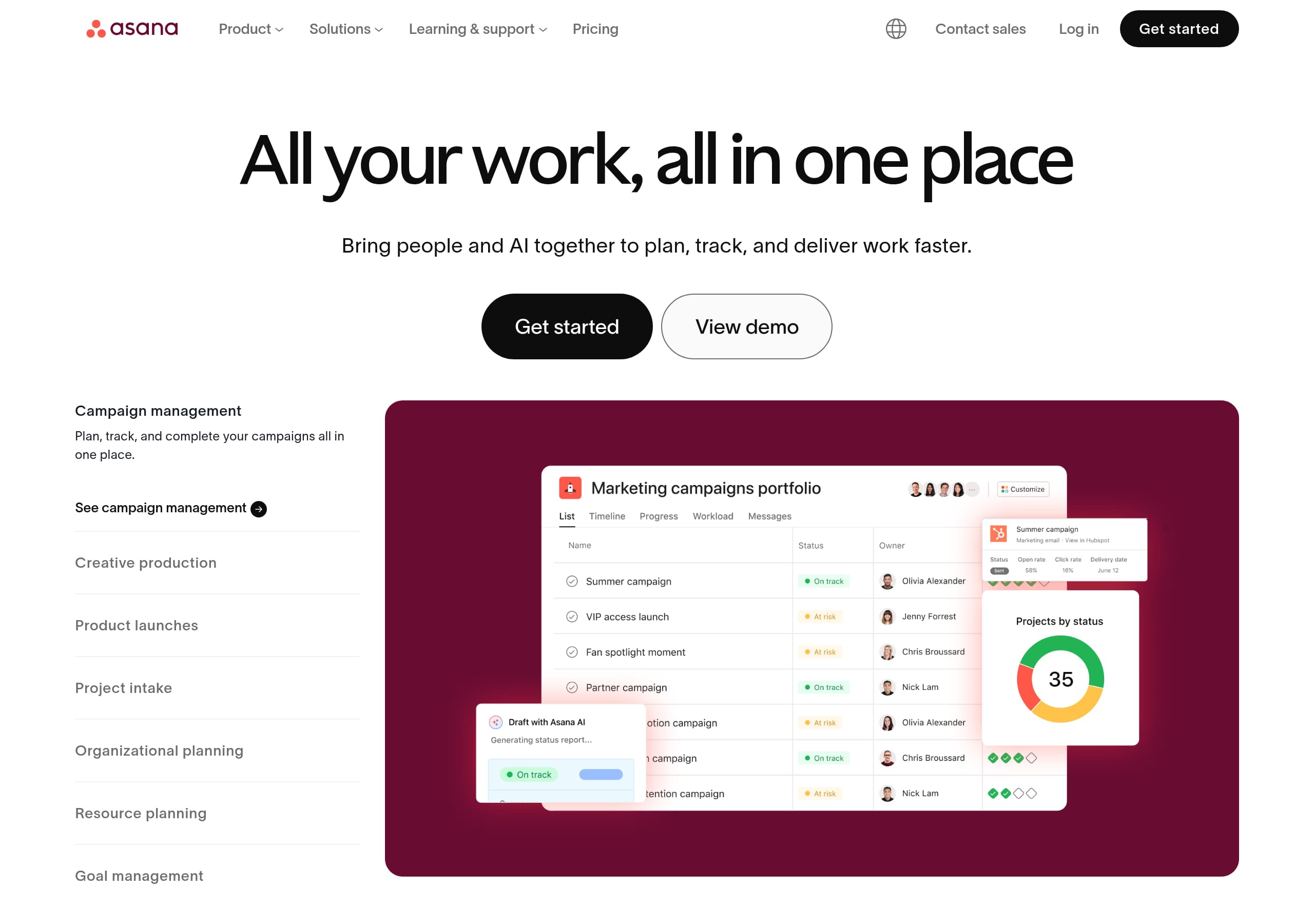 Asana
AsanaAsana’s homepage clarifies the category and outcome fast by pairing a single-sentence value prop (“All your work, all in one place”) with dual CTAs (“Get started” and “View demo”) that serve both self-serve and sales-led buyers.
View breakdown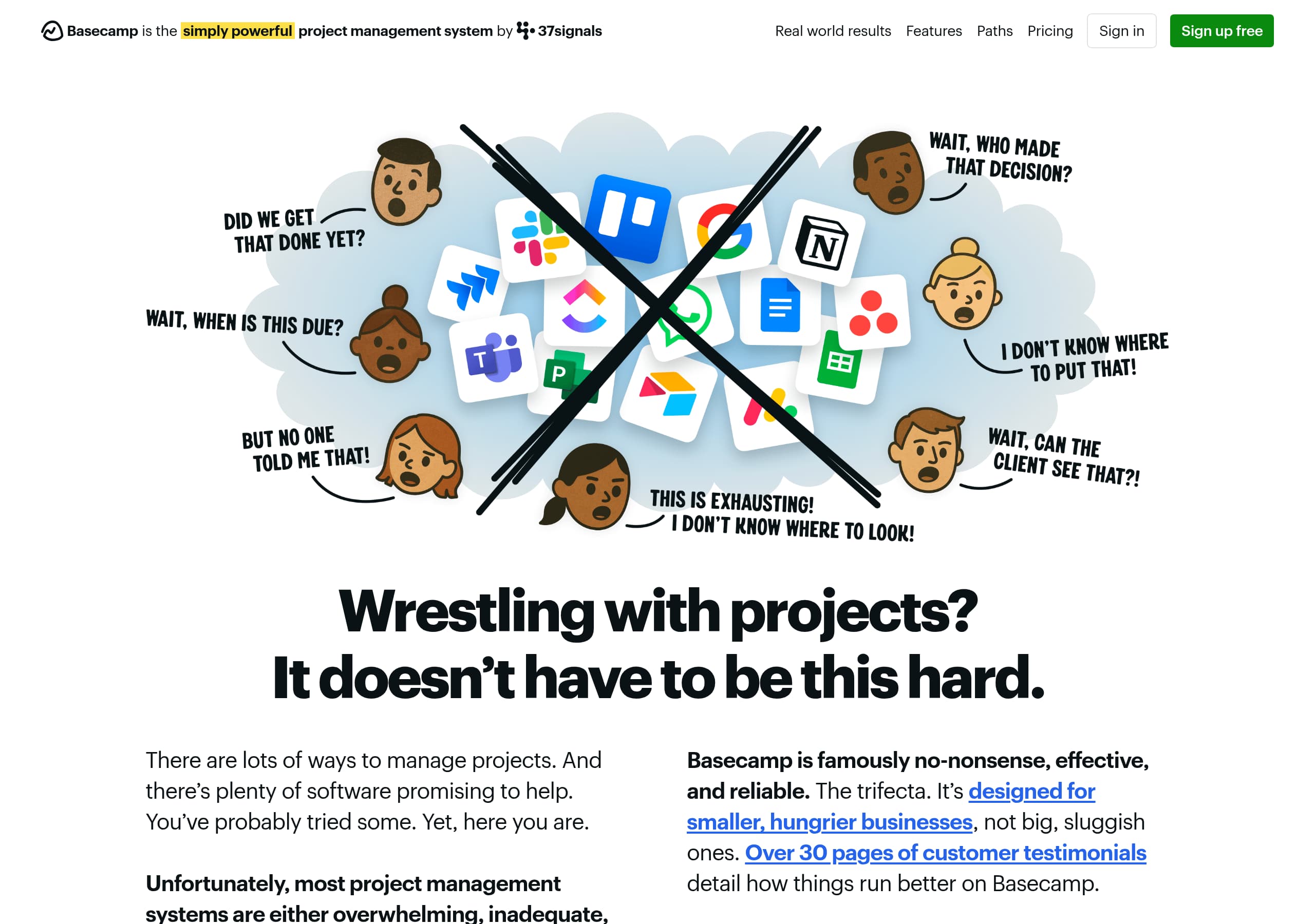 Basecamp
Basecamp’s homepage leads with a contrarian, plainspoken promise (“refreshingly straightforward”) and backs it up with specific credibility markers like a 21-year track record and quantified uptime, which reduces skepticism early.
View breakdown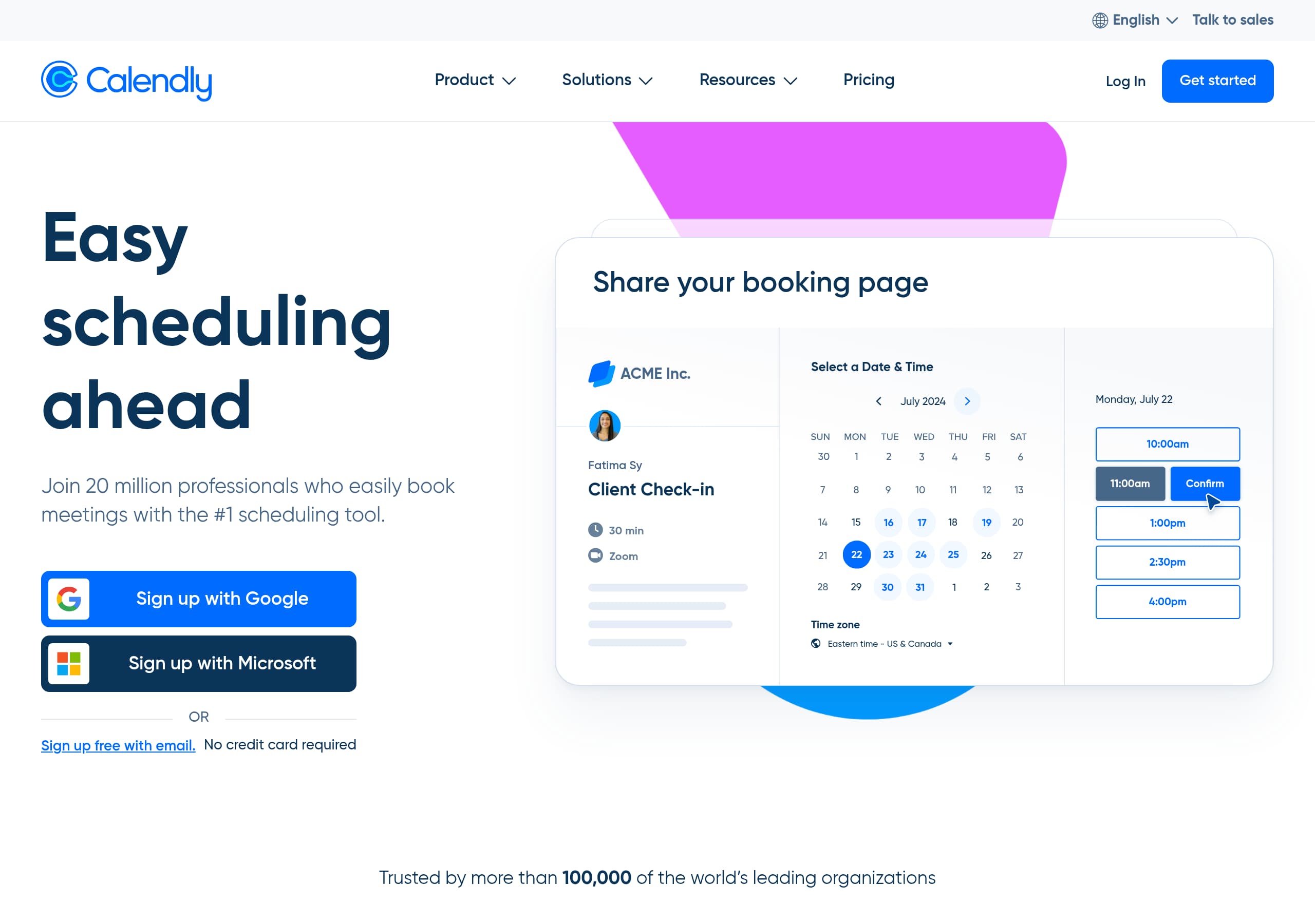 Calendly
Calendly’s homepage leads with a plain-language promise, “Calendly makes scheduling simple,” and immediately supports it with a product-fit statement that spans individuals to enterprises, which reduces confusion for mixed audiences.
View breakdown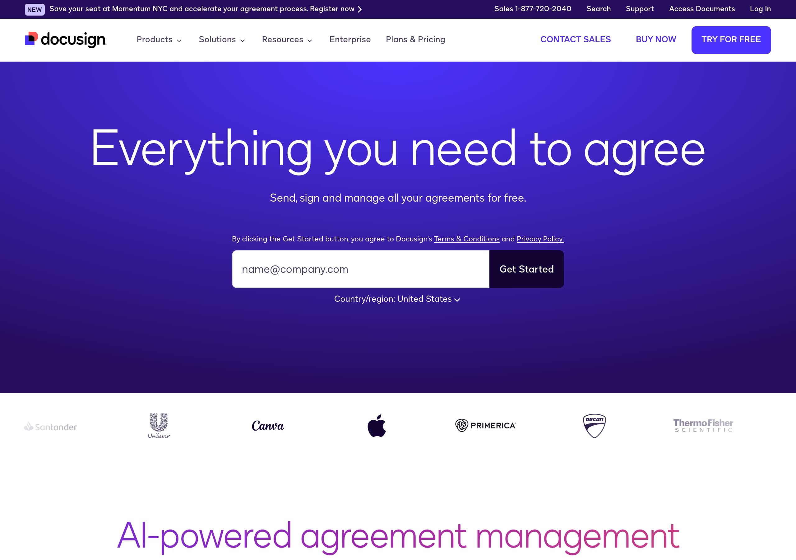 DocuSign
DocuSign positions itself beyond eSignature by consistently anchoring messaging around Intelligent Agreement Management (IAM), which expands the perceived scope from signing to end-to-end agreement operations.
View breakdown Guru
GuruGuru’s homepage makes the product immediately understandable with a single-sentence value proposition, “Your AI Source of Truth,” then clarifies the workflow in three verbs: “Ask, chat, and research,” followed by “automate the upkeep.”
View breakdown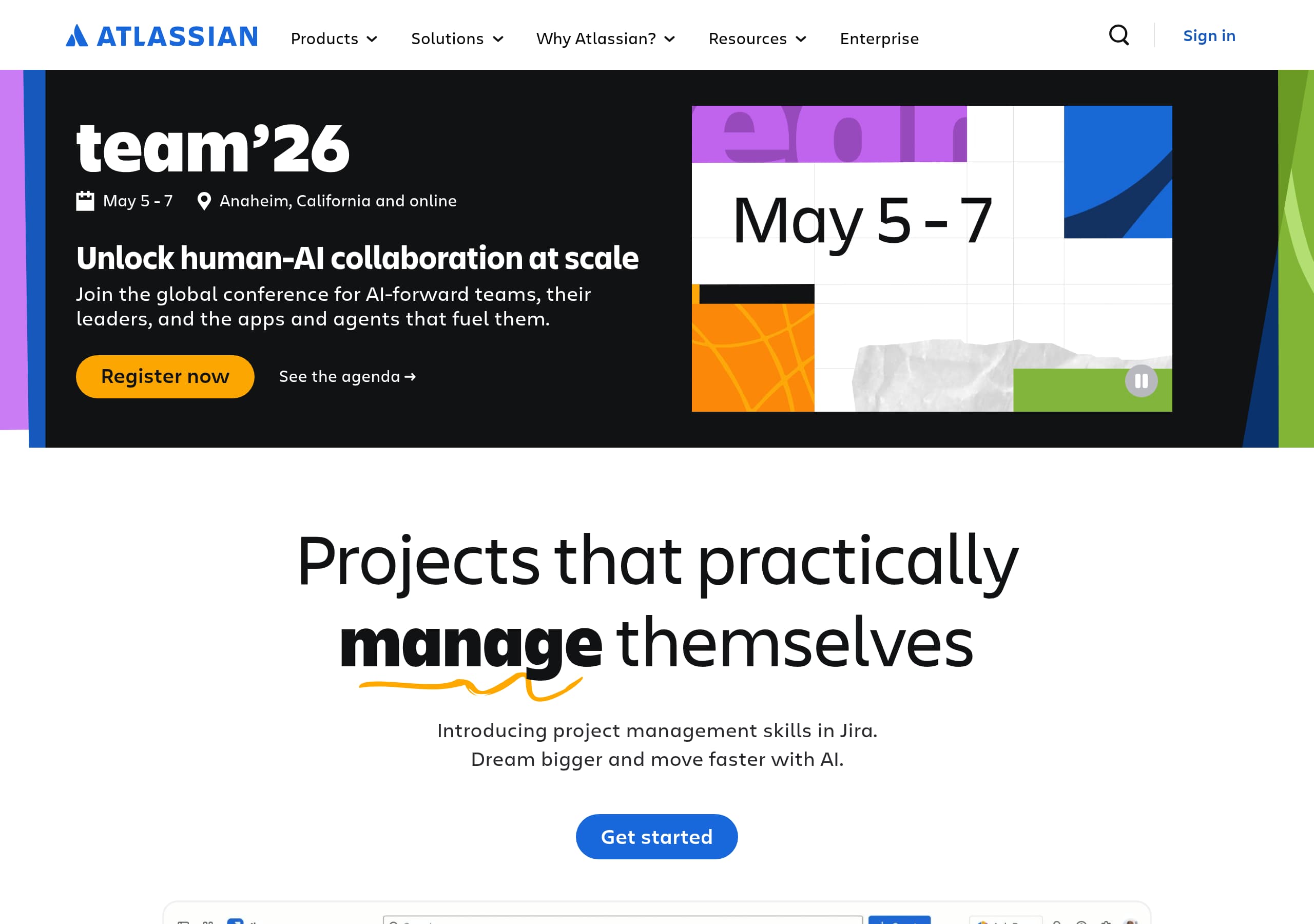 Jira Software
Atlassian’s Jira Software positioning wins by selling a “Teamwork platform built for the AI-era” rather than a single tool, using collections (Rovo, Jira, Confluence, Loom) to increase product attach rate.
View breakdown Linear
The issue tracking tool you'll enjoy using
View breakdown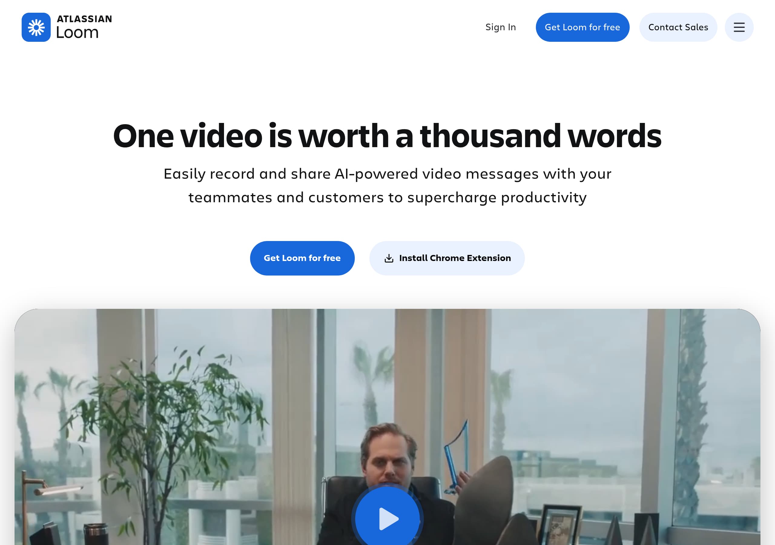 Loom
LoomLoom’s homepage communicates the product in one pass with a single-sentence value prop, “Easily record and share AI-powered video messages,” then reinforces it with a clear “Get Loom for free” CTA and device coverage (Mac, Windows, iOS, Android).
View breakdown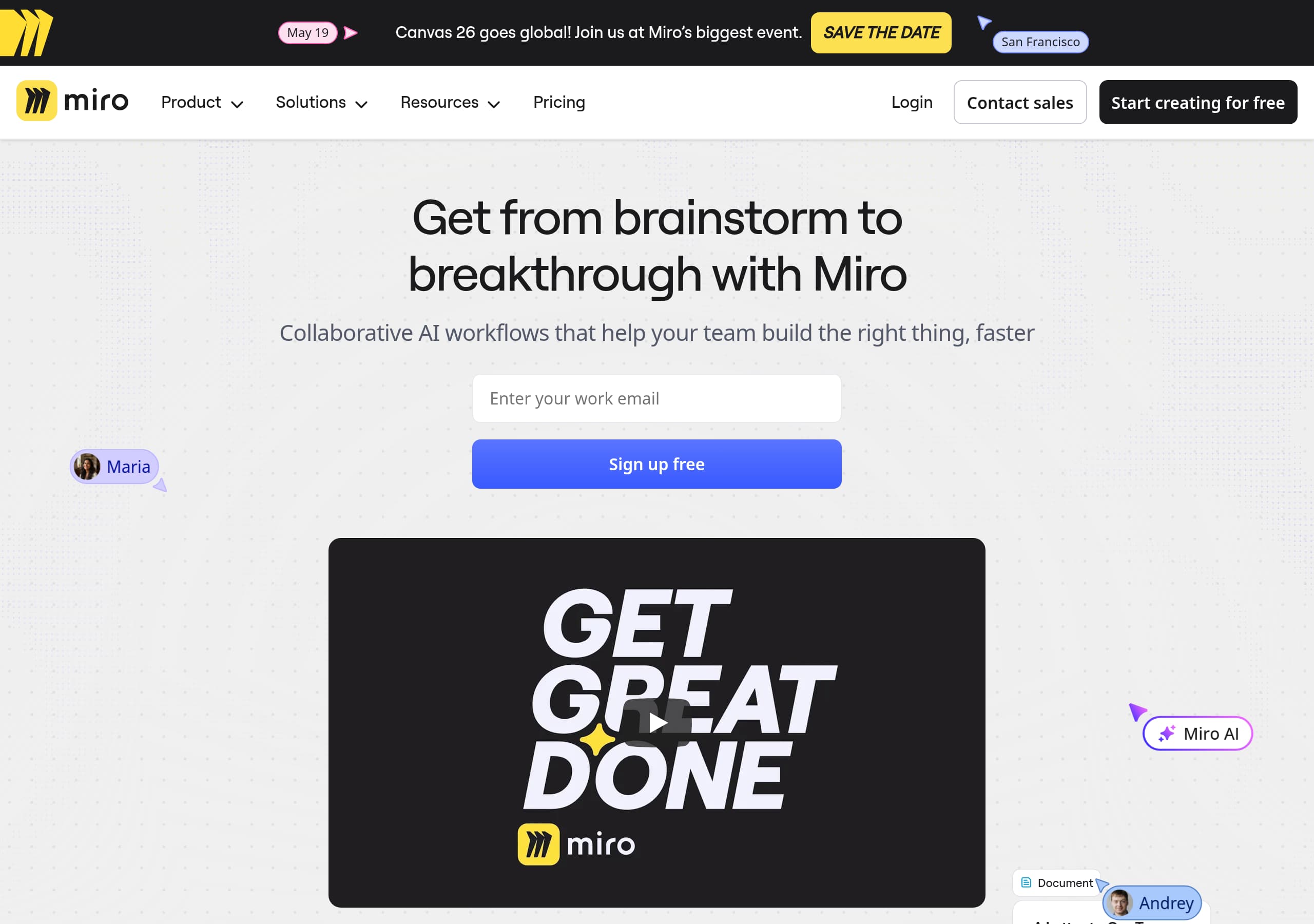 Miro
MiroMiro’s homepage leads with a single, outcome-based promise (“Get from brainstorm to breakthrough”) and backs it up immediately with product UI visuals and quantified adoption (100M users, 250,000 companies).
View breakdown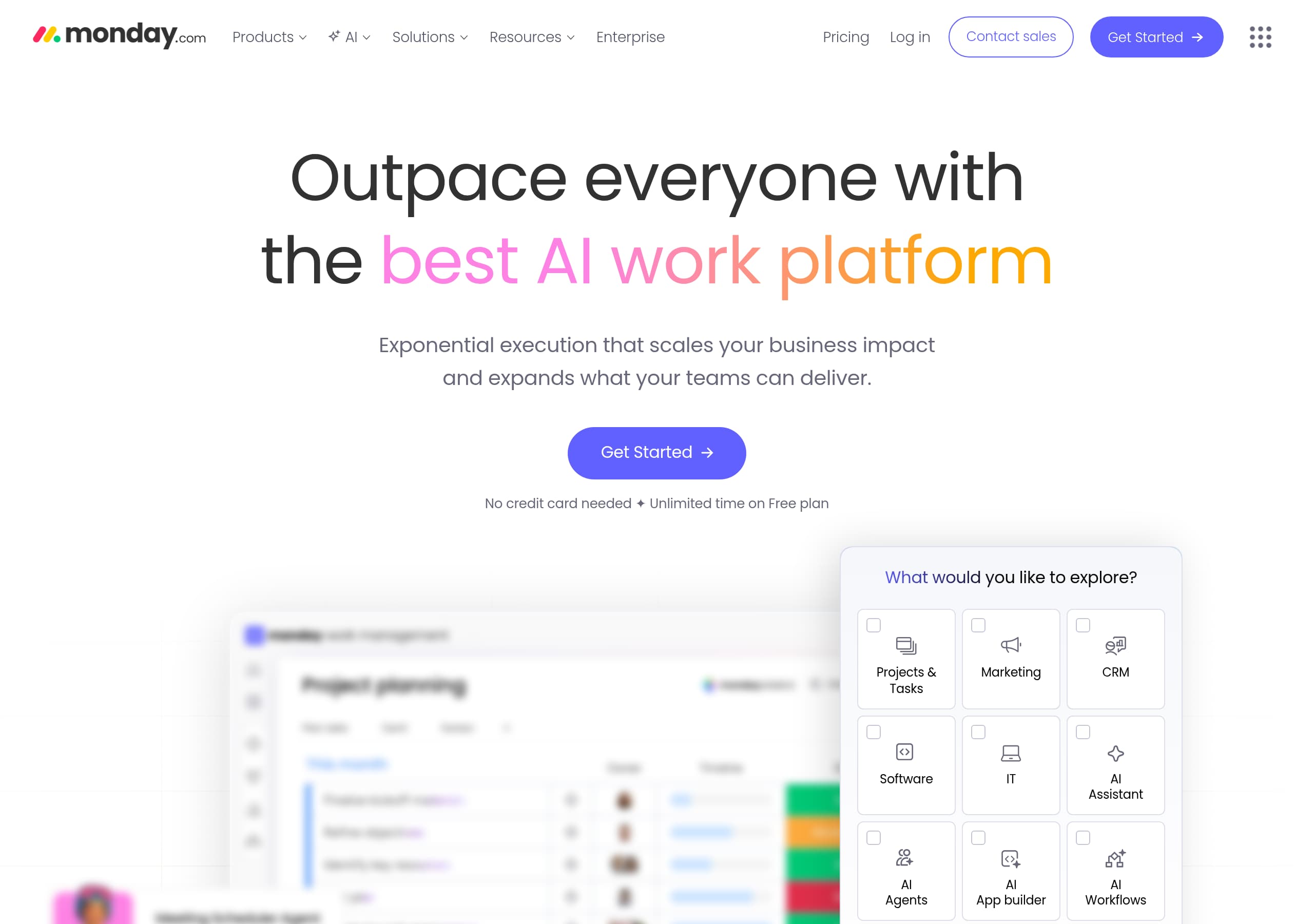 Monday.com
monday.com’s homepage anchors on a single, outcome-driven promise—“Outpace everyone with the best AI work platform”—and repeats a primary CTA (“Get Started”) across major scroll breaks to reduce decision friction.
View breakdown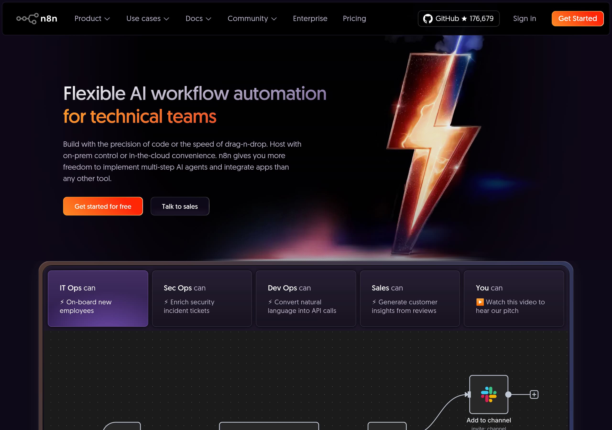 n8n
n8nn8n’s homepage nails the positioning for its core ICP with the hero line “Flexible AI workflow automation for technical teams,” then immediately contrasts **code precision** with **drag-and-drop speed** to reduce ambiguity.
View breakdown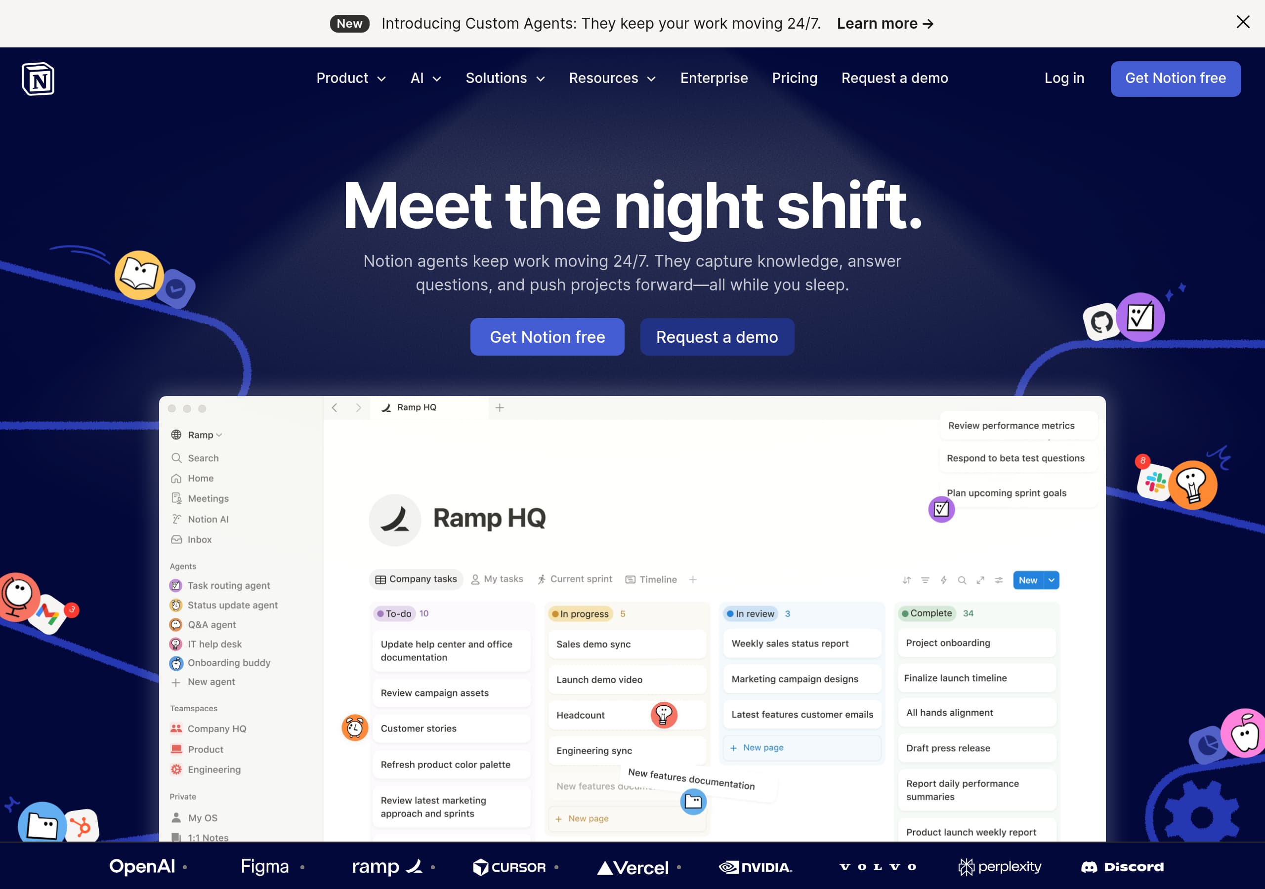 Notion
Notion’s homepage makes the value proposition immediately scannable by anchoring everything to “One workspace. Zero busywork.” and repeating the “AI workspace” framing across navigation, hero, and feature modules.
View breakdown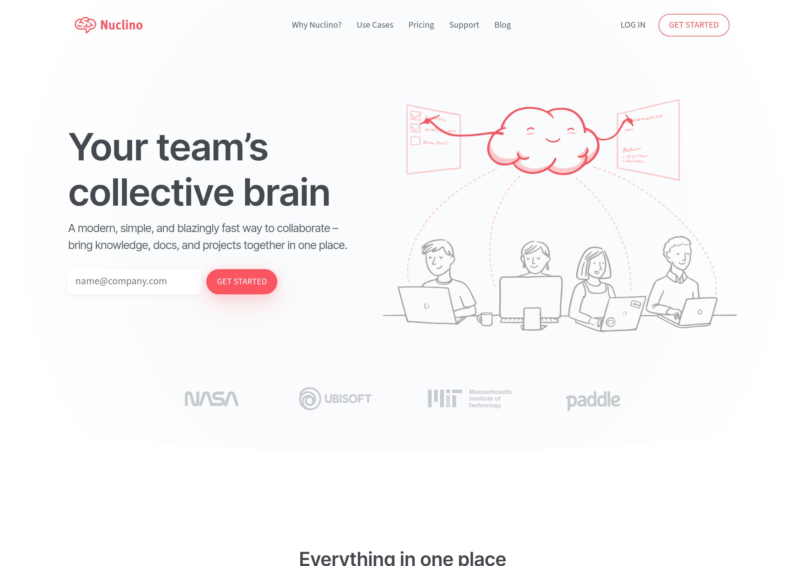 Nuclino
Nuclino’s homepage communicates the product in one line, “Your team’s collective brain,” then immediately clarifies scope with “bring knowledge, docs, and projects together in one place,” which reduces ambiguity for first-time visitors.
View breakdown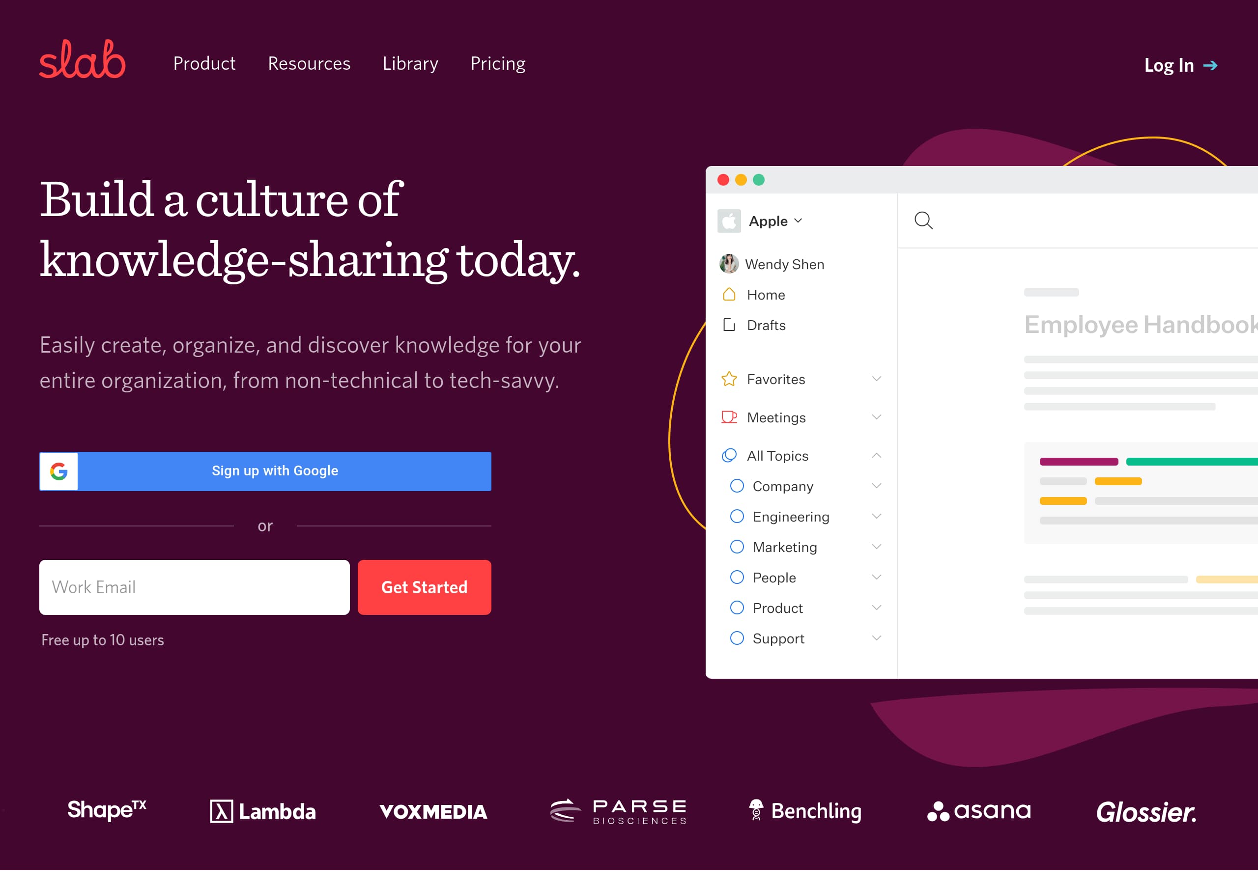 Slab
SlabSlab’s homepage communicates the outcome quickly with the headline “Build a culture of knowledge-sharing today,” then immediately clarifies scope with “knowledge base, pure and simple,” which reduces category confusion for buyers comparing Confluence
View breakdown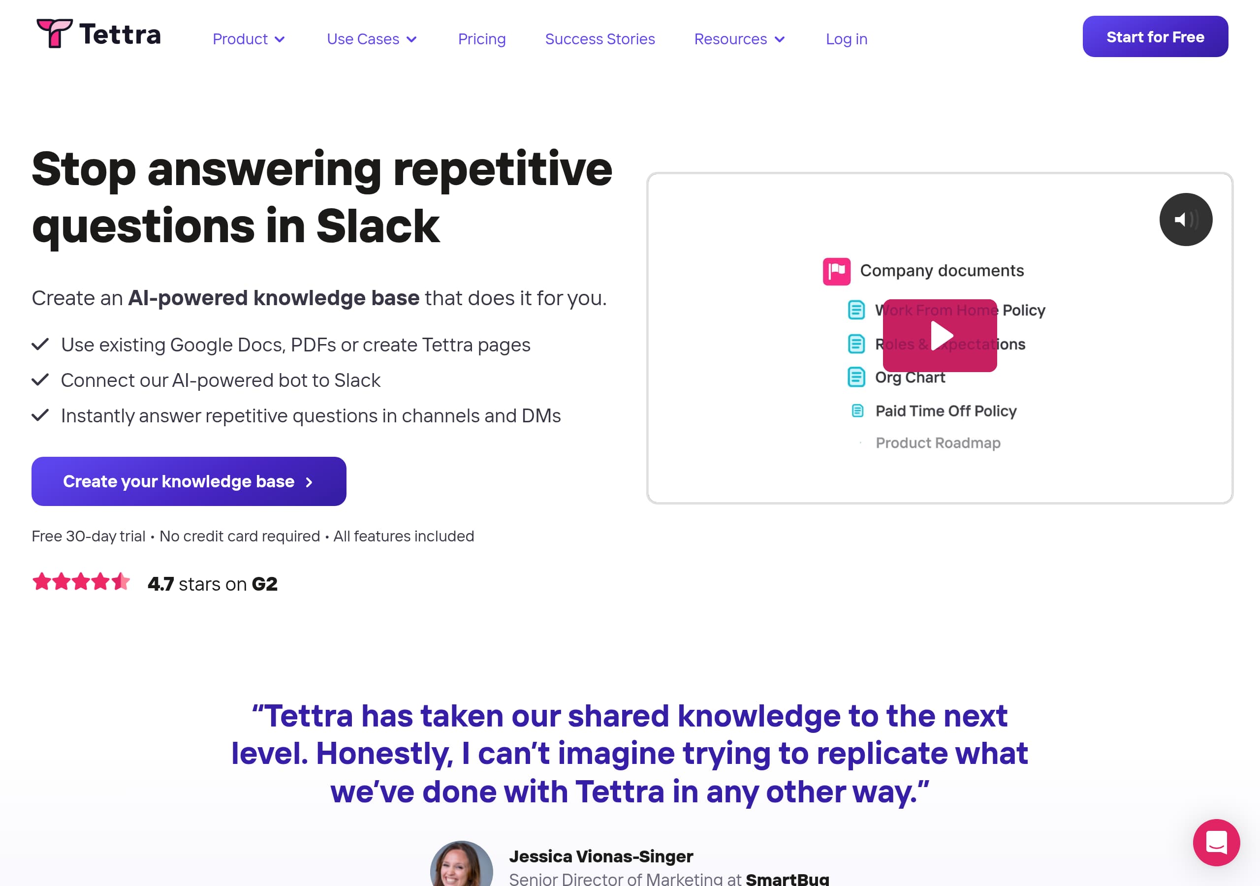 Tettra
Tettra’s homepage nails a pain-first message with an exact scenario buyers recognize, “Stop answering repetitive questions in Slack,” and follows with a simple 3-step story that explains how the product works.
View breakdown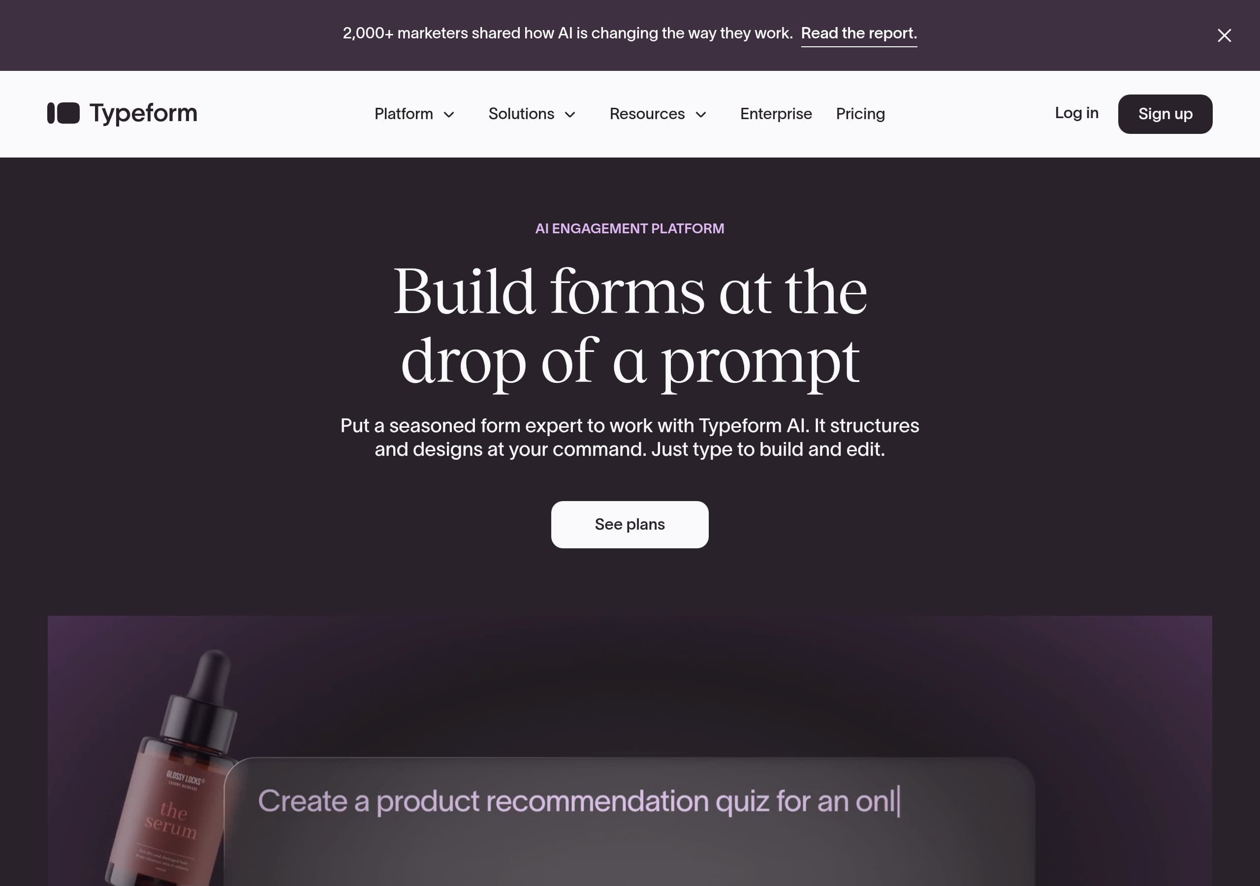 Typeform
Typeform’s homepage leads with a clear, modern positioning—“AI engagement platform”—and immediately demonstrates the core promise with “Build forms at the drop of a prompt,” reducing time-to-value for new visitors.
View breakdown
About our website breakdowns
We analyse each SaaS homepage as a full website teardown. That means we look at the hero, pricing, signup flow, trust elements, and tech stack in turn. Every breakdown comes with key takeaways, section-by-section notes, and the tools we detect. We also score each site on clarity, conversion, and trust so you can see what works and learn from the best-performing SaaS sites.